Minh Doan
Have you ever stumbled across some amazing data visualization tools that run entirely on a web browser (such as this and many others), and wished you could plug in your own data and visualize it? Or, as a biologist, you may know of a good analytic tool, but it either costs too much, requires programming expertise, or requires bundled installations of many other dependencies that might not be compatible with your system… And then you spend more time fixing the tool, than using it. In this blog post, we share how to use browser-based applications and perform tasks in multivariate data analysis and image processing to visualize data (like the one below!), with much less hassle.

No problematic installation!
Most apps mentioned in this tutorial rely on a web browser and therefore will not need any installation, aside from CellProfiler (or other software that can export image features). Although all user levels are welcomed and no coding experience is required, this tutorial assumes you are familiar with some basic functions of image analysis tools.
Experimental set-up
In this example, we will use images from a published study (Blasi et al.), where single Jurkat cells were assayed by imaging flow cytometry. There were three channels for each cell: brightfield, darkfield, and a DNA staining dye, propidium iodide (PI). Using DNA signals (PI), one can easily hand-pick which cell belongs to which phase of the cell cycle. However, it is much less obvious to the human eye to decipher cell cycle phase using only brightfield and darkfield channels. We want to test whether the vast amount of information from label-free channels (brightfield and darkfield) extracted by CellProfiler could be used to predict the cell cycle phase.
To make this exercise more generalizable and resemble common scenarios, we stitched single cell images into montages, where there are usually a few cells per image.
A. Using CellProfiler to perform object detection and feature extraction
For this step, let us use a prepared CellProfiler pipeline. There are some important settings that should be used for now. Once you’re familiar with the workflow, you can easily tune them for your specific needs.
1. Open the downloaded pipeline in CellProfiler.
Experts in the field have already been hand-picked, annotated, and pre-sorted the images into corresponding categories/folders. We will thus use the Metadata module inside CellProfiler to keep track of which category a given object belongs to. I use a parent folder called “Experiment_NNN” to store all the annotated subfolders (G1, S_phase, G2, Prophase, Metaphase, Anaphase, Telophase); so let us use the text “Experiment” as an anchor to easily capture the category names.

2. In the ExportToSpreadsheet module, we will export extracted data from CellProfiler into a .CSV format.
Note that we should add Metadata columns into the data file.
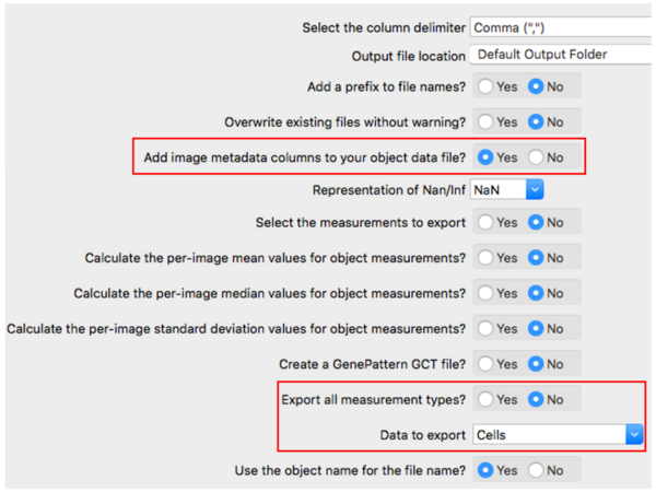
For simplicity, we will only export one data table.
** If you’re more familiar with table handling using Pandas in Python, feel free to export multiple data tables. If you want to export a single joint table of multiple data, just be aware, you may then have 2 rows of headers.
3. Extract the downloaded example images, and drag and drop them to CellProfiler. Set output path at View Output Settings at the bottom of CellProfiler. Finally, click Analyze Images. Once CellProfiler is finished, you should be able to see .CSV file(s) in your output location. In this example, that file is “Cells.csv”.
B. Run a Python script on Google Colaboratory
Again, no need for installation! Google has a handy online environment to run Python code in a Jupyter Notebook style. Simply open this link.
I’ve prepared a script for you to perform basic steps of data cleaning, including removal of empty rows, features that have zero variance (e.g. 1,1,1,1,1,… on every object), and highly correlated features (e.g., if feature_02 values are exactly 3 times bigger than feature_45 values, then we’ll keep only one of the features, either 2 or 145, arbitrarily). The script also scales all features to a unified range (e.g. -1 to 1)
1. Upload the script to Google Colab:
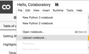
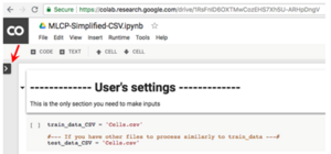
2. Click the arrow on the left, to open a “Files” panel, click “Upload”:
3. Upload the CellProfiler output .CSV file.:
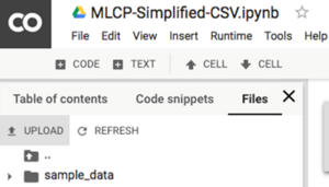
then...

**If you want to keep the uploaded files permanently, you can upload to your own Google drive, inside the “Google Colaboratory” folder. For now, we can just keep them temporarily in the Google Colab environment.
4. Once the file “Cells.csv” is uploaded, run the Python script by clicking the play button on each “cell” (similar to the Jupyter notebook “cell”, where you write and execute codes)

5. Keep running the scripts until you reach the end. I’ve included comments and rationale for the written code. Feel free to use the variations to your liking!
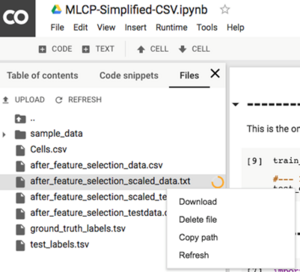
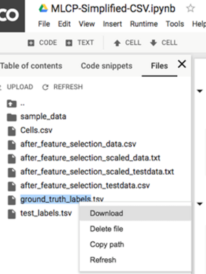
By the end of the script, you should be able to see new outputs in the Files panel on the right hand side:
6. Download these two files to your local computer: “after_feature_selection_scaled_data.txt” and “ground_truth_labels.tsv”
C. Perform dimension reduction on Tensorflow Projector
(Once again, no installation needed!)
By the end of section B, you have a data table of hundred(s) of features per cell. We likely want to do PCA or t-SNE and visualize them in 2D/3D, the dimensions that is easier for humans’ brain to perceive.
Let’s use https://projector.tensorflow.org for this task.
1. Click “Load data” to upload the downloaded files from Step B.6:
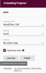
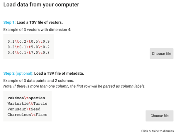
2. Click the top “Choose file” button, and upload the file “after_feature_selection_scaled_data.txt” and then click the bottom “Choose file” button and upload the file “ground_truth_labels.tsv”.
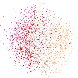
3. After a few moments, you should see the 3D PCA scatter plots of the extracted features.
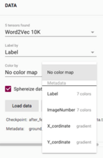
Go to “Color by” and select “Label” to overlay colors of the annotated classes on the plot:
4. Congratulations!
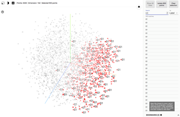
5. Feel free to explore several options to visualize your data, for example, highlighting G1 cells (search box on the right panel):
Congratulations on performing multivariate data analysis by just doing point-and-click using the excellent tools available online! I hope these tips are helpful for you in various applications, and be sure to check back in for a future blog post on using Google Colab for more complex machine learning.
