Fernanda Garcia-Fossa & Anne Carpenter
In a typical quantitative microscopy experiment, biologists choose fluorescent biomarkers and measure particular features (that is “metrics”) that they hypothesize will be perturbed in their samples.
But in image-based profiling, you aim to let the cells tell you what is going on: the idea is to use some broad stains (often using the Cell Painting assay (Bray et al. 2016) and measure all possible morphological features - the collection of features is called a “profile”, and typically you measure about a thousand per cell. Then, you can analyze whether any features are out of the ordinary. Or, you can group samples into clusters based on their image-based profiles.

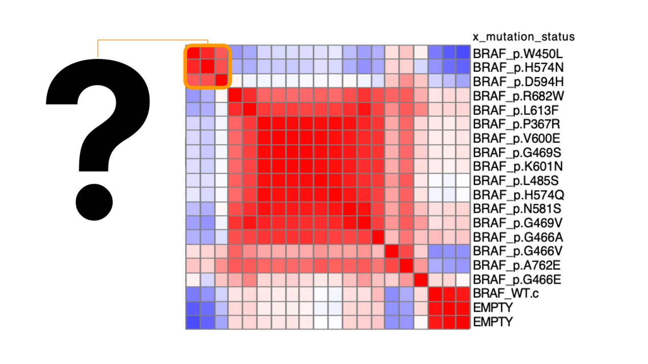
Figure 1: Neat! My samples cluster interestingly… but what is the underlying morphology that makes certain samples look alike? (modified from Caicedo et al 2022)
This leads to a common bottleneck: How do you interpret what a given profile (of a sample or a cluster of samples) means? Here’s the rough outline we follow:
1. Feature names. Sometimes you get lucky and the profile is dramatic in only one or a few features and the feature names have super obvious meanings (nucleus area or the amount of a given stain in a given compartment of the cell). You may need to look up the meaning of the feature names in the CellProfiler manual to understand them better and discern their connection to the biological meaning. Some caution is warranted here; for example, DNA-damaging drugs often show actin features as the most dramatically impacted (because perhaps the cells detach from the plate and begin to round up), so there may not be a straight line from a feature name to the biological function. Wondering how you look up which features are unusual in your sample(s)? We often use the open-source Morpheus software and wrote a short tutorial here (the main page of the GitHub repository has links to a video version as well). We also describe how it is used in our recent protocol.
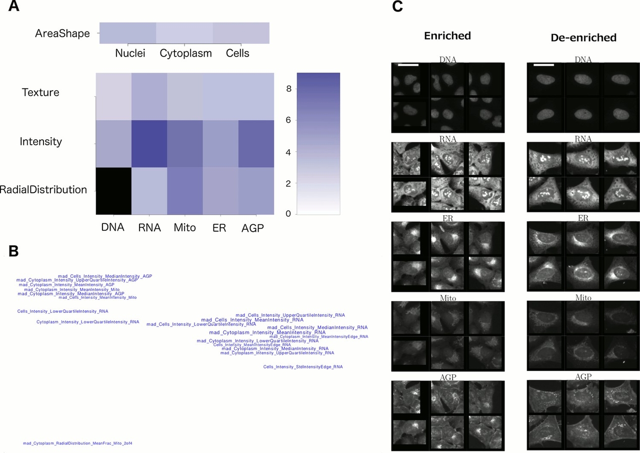
2. Feature categories. Sometimes looking at the groups of unusual features in the profile can reveal a useful pattern. As shown in Figure 2A, one can grasp which channels and feature categories are most influential. In a visualization like Figure 2B where feature names are placed in space based on their similarities (correlations) to each other, one gets a quick sense that there are three basic features influencing this phenotype (rather than being overwhelmed by the original list of 20 feature names). These plots are created using the command line, with scripts from this paper.
3. Expert interpretation. Sometimes there are many features dominant in the profile and their collective meaning is not obvious, but an expert can stare at the list and derive some meaning. For example, one of the most common situations is when cell size is clearly changed - an expert who thinks about morphological features can quickly discern the presence of several seemingly unrelated features that are likely strongly influenced by cell size, such as correlations among other organelles’ staining (because cells that have become small and rounded up tend to have more overlapping stains). If you’ve given it a solid attempt and you need an expert’s help, consider posting to forum.image.sc along with some examples and control images and perhaps someone can help you out.
4. Look at whole images. Sometimes examining example images can decipher a complex profile. You may be stumped at what it means for the minor axis of DNA to be low, the cell area to be low, and the intensity of DNA to be high, but a quick glance reveals the cells in question are in the metaphase stage of mitosis and suddenly the feature changes make sense. Be sure to examine images of control samples for comparison.
5. Look at random single-cell images. Sometimes looking at whole fields of view is inconclusive because there is so much heterogeneity among cells in the image. It can help to look at single cells. We describe scripts to display random cells from a population (together with negative controls) in our recent protocol.
6. Look at representative single-cell images. Random single cells can still reflect substantial heterogeneity, which is confounding; it can be helpful to instead display particular subpopulations of cells. There are two ways we recommend: (a) Display cells whose measurements are closest to the mean for the population. Again, our recent protocol has scripts to carry this out and a step-by-step protocol for doing so. (b) Computationally determine which cells’ phenotypes are enriched and de-enriched for your sample(s) of interest. This is not a trivial step but sometimes is critical for understanding the morphological change. For example, in the image shown in Figure 2C, it becomes clear (together with the knowledge of what features to look for, from Figures 2B and 2C), that the de-enriched cells on the right tend to be large and flat, with relatively symmetric organelles. These displays are created using the command line, with scripts from this paper.
7. Match to other, annotated profiles. Sometimes the profile may ‘match’ or ‘oppose’ profiles from other samples that have useful annotations and those annotations give insights. This requires (a) a data source of annotated compounds and/or genes in a similar cell model and stain set, to query/match against, (b) a decent alignment of the profiles from your experiment and the available database, and (c) computational skills to carry out the queries, given there are currently no user-friendly tools for carrying out identifying top-correlating and anti-correlating samples. We and others are working to create tools that we hope will make this easier for the community in the next few years; scripts for these steps are available in our recent paper. Commercial software is beginning to offer this option as well. Ardigen created a free data portal that accesses the public JUMP Cell Painting data where one can download lists of samples “nearby” (phenotypically similar) to a sample of interest. Spring Discovery also created a free data portal that accesses the public JUMP Cell Painting data that will soon offer their MegaMap capabilities to match samples in the system. Using either software on internal, or private data requires contacting the companies for more information.
8. Associate with the perturbation. Sometimes you cannot make much headway in truly understanding the induced phenotype, so you just let your project-specific perturbations tell you what is going on (i.e. we added this drug, which we know does X, and we see this new population of cells appear, so we just call those cells “X-induced cells”).
9. Let it go. Sometimes you make peace with not knowing. You may have uncovered a novel biological process - congratulations! Or, not; perhaps it is just beyond your capability to figure out the meaning. As frustrating as it may be to not understand why your samples are unique in their morphology, in many experimental setups it is not necessary to understand this mechanistically; you can simply take the profile as a signature of your sample of interest and go forth and use it. For example, if you find a disease-associated morphological change, you can screen drugs to identify compounds that revert that change back to the healthy state, without ever understanding what the phenotype means. You can also cluster huge sets of samples into groups and predict their functional relationships without ever grasping the underlying rationale for how some samples look similar to each other.
Interpreting complex morphology profiles can be a challenge but well worth the effort when you uncover something new!

Figure 2: reproduced from Rohban et al. eLife 2017.
References
1. Bray MA, Singh S, Han H, Davis CT, Borgeson B, Hartland C, Kost-Alimova M, Gustafsdottir SM, Gibson CC, Carpenter AE. Cell Painting, a high-content image-based assay for morphological profiling using multiplexed fluorescent dyes. Nat Protoc. 2016 Sep;11(9):1757–1774. PMCID: PMC5223290
