
Rebecca Senft
Workflow update
June 2024 update
Our recommended normalization workflow is evolving. Please see https://github.com/broadinstitute/jump-profiling-recipe/ for our latest developments on the normalization strategy in specific and aprofiling workflow in general.How to Normalize Cell Painting Data
Let’s talk about normalization: why we normalize data and how we choose a method for normalizing data in Cell Painting experiments. We’ll consider a theoretical example experiment including two plates, each with a different cell type (neurons and fibroblasts). Plates include similar perturbations (different concentrations of Drugs A, B, C, and D) and the main question we’d like to answer is about the differences and similarities between cell type responses to these perturbations. For example, how do neurons respond to Drug A and in what ways is that response similar or different to how fibroblasts respond to Drug A? We’ll call this our two-cell-type experiment.
What is normalization?
Normalization has a few definitions, but we can think about it generally as stretching/adjusting data that come from different places to have a common scale, so that we can compare or combine them more accurately. This is important when our measurements might have very different units or scales and we want to ensure they contribute equally to analysis. Consider a simple example where you measure the height of two people both in feet and in centimeters. The absolute difference in centimeters looks to be larger, but really both measurements represent exactly the same difference in height, just on different scales. We also normalize to reduce the variation in data caused by technical effects (more on this later).
The default pycytominer method for normalization is called “standardize,” which scales the data so that the mean is 0 and the standard deviation (the average distance from each data point to the overall mean) is 1. If you’re familiar with statistics, you might recognize this as a z score. This is computed by taking each data point (x) and subtracting the mean value of the data (μ), then dividing by the standard deviation (s) of the data:
scaled = (x - μ) / s
In our cell painting analysis workflows, we typically use a slightly different normalization method called “RobustMAD.” RobustMAD uses medians instead of means and is thus less impacted by outliers in the data than standardization. In RobustMAD normalization, the median of all data points is subtracted from each data point (x) and then the result is divided by the median absolute deviation (mad) or the median difference between each datapoint x and the median of all data points:
scaled = (x - median) / mad
In other words, the scaled feature measurement output for each sample is based on subtracting the median value across all samples considered (as chosen below) and dividing by those samples’ median absolute deviation. This form of normalization results in a scaled dataset where the median is 0 and the mad is 1.
You can see the code for the function here.
How do we apply normalization to cell painting datasets?
It is important to think about how to apply this normalization to our measurements. In the above descriptions of different types of normalization, we need to compute statistics (mean, mad, median, etc.) based on a reference pool of data. How do we choose what this reference should be? While there are many different ways one could normalize, I’ll discuss three in detail below: whole-plate normalization, normalizing to negative controls, and between-plate normalization.
Our standard choice is to normalize measurements within each plate individually, also called ‘whole-plate’ normalization. So the median and mad used for normalization for a sample are based on all samples within that same plate. This is easy to do computationally, and does a great job correcting for the many tiny "issues" encountered by each plate on its journey to the microscope (see below). However, for multiple plate experiments you need to think carefully about how treatments are scattered across plates. This strategy works great if you have a random sampling of treatments on a given plate and if all plates have similar proportions of unusual/active samples. For typical chemical and genetic screens, this criterion is met. By contrast, consider a hypothetical case where all drugs on Plate 1 cause a G1 cell cycle arrest and all drugs on Plate 2 cause a G2 cell cycle arrest. Since the median well on Plate 1 will be G1 arrested and the median well on Plate 2 will be G2 arrested, we can anticipate at least two major problems here: 1) it won't look like our drugs do anything, because they all look like the median well on their own plate, and 2) we can can't compare any drug on Plate 1 to any drug on Plate 2, because they were each normalized to something very different.
The second option is to normalize each plate to just the negative controls present on that plate: cells receiving either no treatment or just a sham "treatment" with something like solvent. This strategy is applicable to experiments containing any assortment or concentration of samples on particular plates, but has a catch: for this normalization option to be robust and stable, we need to sample enough negative control wells present in each plate to form an accurate estimate of control measurements. This approach requires at least 16 control wells and preferably more, especially if the controls are confined to a particular row or column in the plate and are thus subject to edge effects (see bonus section).
A third option you might consider is combining the data from all plates and then normalizing across all plates (also called between-plate normalization). This is not recommended. There are two main reasons why:
- Plate effects - In an ideal world, combining all the data first and then normalizing makes a lot of sense. Considering our two-cell-type experiment, if we perform whole-plate normalization on each plate separately, we might obfuscate real differences between cell types present on different plates. It seems like between-plate normalization would avoid this problem by including the full range of measurements for all cell types when calculating our reference statistics.
On the other hand, normalizing across plates is dangerous because we know from experience that there are often real differences between plates (‘plate effects’ or ‘batch effects’) that have nothing to do with treatment or cell type. These differences are often a culmination of many factors like 1) cells plated on different days or different densities, 2) the order in which plates were imaged, 3) differences in exact fixation duration, or 4) position of plates in the incubator. Altogether, plate-related technical effects are virtually impossible to entirely control for, but have the net effect of causing cells on the same plate to be more similar to each other than to cells on different plates. If we don’t normalize within a plate, we risk plate effects obfuscating the biological effects we care about in the data.
How do we deal with plate effects, then? Thoughtful design of the layout of samples across plates is the only way to be confident we can accurately measure each sample (see Bonus section for an example). For the same reason, it’s very important to make sure technical replicants of perturbations are present across plates. If Plate 1 receives Drug A, and Plate 2 receives Drug B, we can’t be sure whether the differences in measurements between cells in Plate 1 and Plate 2 are due to the drug treatment or whether they merely reflect plate-to-plate technical variation. Placing Drug A and Drug B across both plates avoids this challenge.
- Cell type differences are typically much larger than perturbation effects - Different cell types often look very different from each other. Neurons look different from adipocytes, which also look different from fibroblasts, etc. These differences are reflected in the measurements we make in CellProfiler. Usually the differences in measurements between cell types is much larger than the difference caused by a perturbation within a cell type. In our two-cell-type experiment, if you just wanted to know on average how one cell type is different from another, then combining and normalizing the plates all together makes sense (however, with the caveats from the above section). However, this approach will reduce your ability to see treatment effects, as patterns in the data will be driven primarily by cell type (Fig 1).
Here’s a visual representation comparing whole-plate and between-plate normalization for our two-cell-type experiment (Fig 1A) where the point shape is the cell type and color represents a treatment or perturbation. Only two measurements are shown for simplicity, but you could also think about this as analogous to a dimension-reduced plot, like t-SNE or UMAP plots, where closeness is indicative of similarity (so points that are close to each other on the plot are more similar).
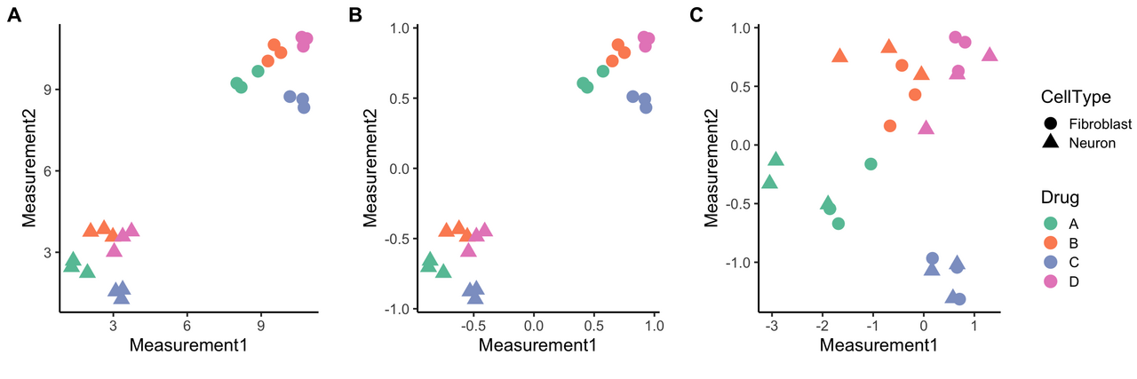
Figure 1. Between-plate vs. whole-plate normalization. The first graph (A) is a simple example where cell type is indicated by shape, treatment with different drugs is color-coded, and only raw (un-normalized) measurements are shown. There are two main groups of samples, and they naturally cluster by cell type, which dominates over the differences in drug treatments. Combining data from different cell types and then normalizing (B, note the change in X and Y axes) still emphasizes cell type as the main source of similarity/grouping, whereas whole-plate normalization (C) reduces effects from different cell types and makes drug treatment effects more apparent.
If you combine data before normalizing (Fig 1B), you’re mostly going to see two big groups emerge that emphasize cell type similarities. Neurons group with other neurons and fibroblasts with other fibroblasts. The treatment effects are there as well, but harder to detect. However, if you normalize each plate (Fig 1C), and thus each cell type, separately, you can more easily detect effects of drug treatment. For our two-cell-type experiment, we thus recommend whole-plate normalization. These drug effect patterns can then be compared across cell types.
Check out this article from the lab on data analysis strategies for profiling experiments and this chapter from the NIH Assay Guidance Manual for more information.
Bonus! Plate-Layout Effects
We can’t warn you about plate effects without also talking about plate-layout effects, also known as well position effects. As was the case for plate effects, many factors can contribute to plate-layout effects (e.g. uneven evaporation, uneven heat distribution, order of imaging, etc.). As a result, plate-layout effects cause wells that are in the same positions across plates to be more similar to each other than wells in random different positions. Even considering two identical plates with the same treatment for all wells, plate-layout effects would still cause enhanced similarity based on row/column position.
What can we do about plate-layout effects? Ideally, treatments would be present in all plates and randomly distributed or scrambled across different well positions (i.e., you don’t want Drug A to always be in row A and Drug B to always be in row E). For a variety of reasons (financial, technical), this often isn’t possible to do. There are several other strategies to mitigate these effects, including
- Avoiding using the outer rows and columns of a plate (where these effects tend to be strongest - hence the related term “edge effects”)
- Filtering washing reagents
- Mixing chemicals to avoid them settling at the bottom of the well [REF]
- Allowing cells to settle for 1 hour at room temperature before placing them in the incubator [REF].
Including several plate layout variations in your experiment is another method to reduce plate-layout effects in your data. We’ve included a sample pseudo-scrambled plate layout that balances ease of use with reducing positional effects (Fig 2).
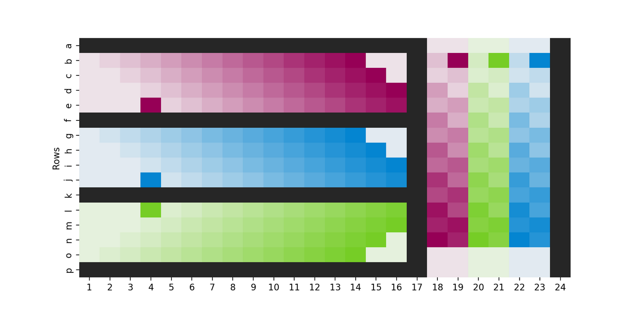
Figure 2. Example plate layout to minimize plate-layout effects. This is a real Cell Painting plate layout (aka platemap) from an experiment where, on each of two plates, 288 of the 384 wells were used and the design was hand-plated; for each of 3 cell types (colors) 18 untreated wells (lightest shade) were plated, as well as 6 replicates each of 13 treatment conditions (shade of color). Note that the cell line that is furthest from the edge in the horizontal section (blue) is closest to it in the vertical section, and each row/column within a cell line is slightly staggered from its neighbors (looping back in some places). This helps create a “pseudo-scramble” that at least means not all wells of each condition have equal distance to the edge, but with a pattern that stays simple enough that it is reasonable to pipette without mistakes. Black wells contained media but no cells, as this has been shown to mitigate edge-related evaporation issues.